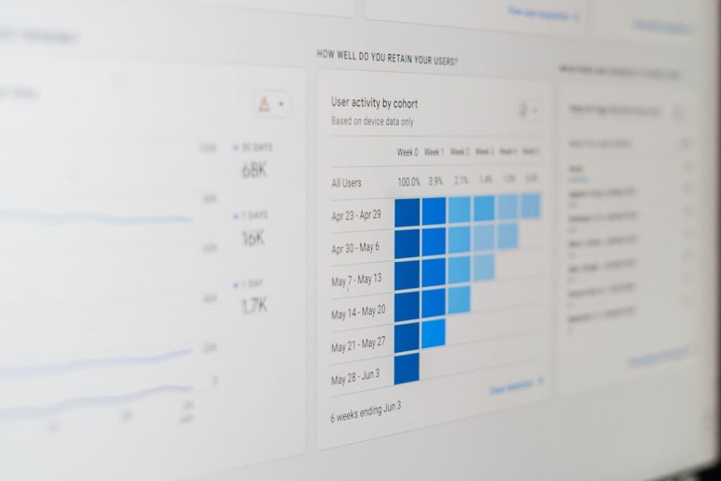
We embark on the critical journey of building customer success dashboards, a vital endeavor for any organization aiming to thrive in today’s competitive landscape. Our customers are the lifeblood of our business, and understanding their journey, their triumphs, and their challenges is not merely a beneficial practice; it is a fundamental necessity. Dashboards serve as our compass and our map, guiding us through the complex terrain of customer relationships, revealing hidden patterns, and illuminating the path forward. Without them, we are ships adrift in a vast ocean, relying on guesswork rather than informed decisions.
Before we even consider the colors of our dashboard or the specific metrics we will track, we must establish a solid foundation. This involves a deep understanding of our overarching goals and, crucially, who we are building this dashboard for. A dashboard is not a monolithic entity; it is a tailored tool designed to serve specific needs.
Identifying Our Strategic Objectives
What are we trying to achieve with our customer success efforts? Are we focused on reducing churn, increasing customer lifetime value, driving product adoption, or fostering advocacy? Our strategic objectives act as the bedrock upon which our dashboard is built. Each metric, each visualization, must directly support these larger aims. If our primary goal is to reduce churn, then metrics related to customer health, sentiment, and engagement will take center stage. If our aim is to drive advocacy, then metrics around referrals, testimonials, and social sharing will be paramount. We need to ask ourselves: what does success look like for our business, and how can our customers’ success translate into that?
Understanding Our Stakeholders and Their Information Needs
Who will be interacting with this dashboard? Is it for the customer success managers (CSMs) directly engaged with customers, the sales team looking to identify expansion opportunities, the product team seeking feedback on feature adoption, or the executive leadership requiring a high-level overview of customer health? Each stakeholder group has unique information requirements. A CSM might need granular details on individual customer accounts, while an executive might be more interested in aggregate trends and overall customer sentiment. We must tailor the dashboard’s design and data presentation to meet these diverse needs, ensuring that the right information reaches the right eyes at the right time. If we try to be all things to all people with a single dashboard, we risk creating a cluttered and ineffective tool.
Aligning with Business Goals
Our customer success dashboard is not an isolated island of data; it must be firmly anchored to our broader business objectives. If our company goal is to achieve a certain revenue growth target, then our dashboard should clearly articulate how customer success contributes to that target. This could involve tracking metrics like net revenue retention (NRR) or identifying upsell and cross-sell opportunities within our existing customer base. The dashboard should serve as a visible bridge between customer well-being and business prosperity, demonstrating the tangible impact of our efforts.
For those interested in enhancing their understanding of customer success metrics and the importance of effective dashboard design, a related article can be found at Shilotri Books. This resource delves into various strategies and best practices for building dashboards that not only track key performance indicators but also drive actionable insights for customer success teams.The Core Components: Selecting Key Performance Indicators (KPIs)
Once our strategic direction and audience are clearly defined, we can move to the heart of our dashboard: the selection of Key Performance Indicators (KPIs). These are the quantifiable measures that will tell us whether we are on track to achieve our objectives. Choosing the right KPIs is akin to selecting the right tools for a craftsman; the wrong tools will hinder progress, while the right ones will enable precision and efficiency.
Measuring Customer Health
Customer health is a multifaceted concept, and its measurement is crucial for proactive customer success. We need to capture a holistic view of how our customers are faring.
Usage and Engagement Metrics
- Feature Adoption Rate: This tracks the percentage of users within a customer account who are actively utilizing key features of our product or service. A low adoption rate for critical features can indicate potential dissatisfaction or a lack of understanding, signaling a risk of churn. We need to go beyond simply seeing if they logged in; we need to understand if they are deriving value from our offering.
- Frequency of Use: How often do our customers engage with our product or service? Are they daily active users (DAU), weekly active users (WAU), or monthly active users (MAU)? A decline in frequency can be an early warning sign.
- Depth of Engagement: Are customers using our product superficially, or are they digging deep and utilizing its full potential? This can be measured by the number of features used, the duration of sessions, or the completion of advanced workflows.
- Time to First Value (TTFV): How quickly do new customers experience the core benefit of our product or service? A shorter TTFV indicates a smoother onboarding process and a faster realization of value, leading to increased stickiness.
- Customer Satisfaction (CSAT) Scores: Regular surveys measuring customer satisfaction with specific interactions or overall experience. While important, CSAT should be viewed in conjunction with other metrics, as satisfied customers can still churn.
Product Performance and Health Metrics (for software/SaaS)
- Uptime and Reliability: For software, consistent performance is paramount. Downtime or frequent bugs can severely impact customer trust and lead to frustration.
- Response Times: How quickly does our system respond to user actions? Slow response times can be a significant detractor from the user experience.
- Error Rates: Frequent errors can indicate issues with our product or underlying infrastructure.
Tracking Churn and Retention
Churn is the silent killer of many businesses. Diligently tracking and understanding churn is paramount for sustainable growth.
Churn Rate Metrics
- Customer Churn Rate: The percentage of customers who stop using our product or service over a given period. This is often broken down into gross churn (all customers lost) and net churn (customers lost minus any expansion revenue).
- Revenue Churn Rate: The percentage of recurring revenue lost from existing customers over a given period. This is often more impactful than customer churn, as losing high-value customers can significantly impact revenue.
- Logo Churn vs. Revenue Churn: It is vital to distinguish between losing individual customers (logo churn) and losing revenue (revenue churn). A company might lose many small customers but retain its high-value clients, resulting in low revenue churn.
Retention Metrics
- Customer Retention Rate: The inverse of churn, measuring the percentage of customers who remain with our business over a given period.
- Net Revenue Retention (NRR): This is a gold standard metric, measuring the percentage of revenue retained from existing customers, accounting for upsells, cross-sells, and churn. An NRR above 100% indicates that our expansion revenue from existing customers is outpacing churn.
- Gross Revenue Retention (GRR): This measures the revenue retained from existing customers, excluding any expansion revenue. It provides a baseline understanding of how much revenue we are losing due to churn.
Gauging Customer Sentiment and Advocacy
Beyond usage and transactional data, understanding what our customers feel is crucial. This qualitative data, when combined with quantitative metrics, paints a richer picture.
Sentiment and Feedback Metrics
- Net Promoter Score (NPS): Measures customer loyalty by asking how likely they are to recommend our product or service to others. NPS categorizes customers into Promoters, Passives, and Detractors, providing actionable insights into areas of strength and weakness.
- Customer Effort Score (CES): Measures how much effort a customer had to exert to get their issue resolved or request fulfilled. Lower effort generally leads to higher satisfaction.
- Qualitative Feedback Analysis: Utilizing text analytics and sentiment analysis on survey responses, support tickets, and social media mentions to identify common themes and pain points.
Advocacy Metrics
- Referral Rate: The number of new customers acquired through referrals.
- Testimonial and Case Study Submissions: Tracking the quantity and quality of customer-generated marketing materials.
- Social Media Mentions and Engagement: Monitoring brand mentions and the sentiment expressed on social platforms.
Designing for Clarity: Visualizing Our Data Effectively

A dashboard is only as good as its ability to communicate information clearly and concisely. We need to employ effective data visualization techniques to transform raw data into actionable insights. Imagine our dashboard as a well-organized toolbox; each tool, clearly labeled and within easy reach, serves a specific purpose.
Choosing the Right Chart Types
The selection of chart types should be guided by the nature of the data and the story we want to tell.
Bar Charts and Line Graphs
- Bar Charts: Excellent for comparing discrete categories or showing changes over time when the number of time periods is relatively small. For example, comparing feature adoption rates across different customer segments.
- Line Graphs: Ideal for displaying trends over continuous periods, such as tracking customer churn rate month-over-month or month-over-month revenue growth. They highlight patterns and fluctuations effectively.
Pie Charts and Donut Charts
- Pie Charts/Donut Charts: Best suited for showing proportions of a whole, limited to a small number of categories. For example, the breakdown of customer segments contributing to recurring revenue. However, their use should be judicious, as they can become misleading with too many slices.
Scatter Plots and Heatmaps
- Scatter Plots: Useful for identifying correlations between two numerical variables. For instance, plotting customer health score against product usage to see if there’s a relationship.
- Heatmaps: Can visually represent complex data matrices, often used to identify patterns in user activity or engagement across different features and time periods.
Utilizing Dashboards for Different Audiences
As discussed earlier, different stakeholders require different views. A single, complex dashboard is rarely the most effective solution.
Executive Dashboards
- High-Level Summaries: Focusing on key metrics that impact overall business performance, such as NRR, overall customer health score, and major churn drivers.
- Trend Analysis: Providing a clear overview of how key metrics are evolving over time.
- Strategic Insights: Highlighting areas requiring executive attention and decision-making.
Operational Dashboards for CSMs
- Individual Account Health: Granular view of each customer’s health score, recent activity, support tickets, and potential risks.
- Task Management Integration: Linking to customer-specific tasks and outreach activities.
- Proactive Alerting: Notifications when a customer’s health score drops below a critical threshold.
Product Team Dashboards
- Feature Adoption and Usage: Detailed insights into how specific features are being used, by whom, and their impact on customer success.
- User Feedback Aggregation: Centralized view of customer feedback related to product features.
- Bug and Performance Tracking: Visibility into product-related issues affecting customers.
The Importance of Interactivity
Static dashboards offer limited value. We need to empower our users to explore the data.
- Drill-Down Capabilities: Allowing users to click on a summary metric and see the underlying data that contributes to it.
- Filtering and Segmentation: Enabling users to filter data by customer segment, region, plan type, or any other relevant attribute.
- Date Range Selectors: Providing flexibility to analyze data over different time periods.
Building the Dashboard: Tools, Technology, and Implementation

The actual construction of our customer success dashboard requires careful consideration of the tools and technologies at our disposal, as well as a robust implementation strategy. This is where the blueprints are translated into tangible structures.
Leveraging Existing CRM and Customer Success Platforms
Many of our existing systems already hold valuable data. We should aim to integrate these sources rather than recreating data silos.
- Customer Relationship Management (CRM) Systems: Platforms like Salesforce, HubSpot, and Microsoft Dynamics are rich repositories of customer contact information, sales history, and interaction logs. Integrating these with our dashboard provides crucial context.
- Customer Success Platforms (CSPs): Dedicated CSPs such as Gainsight, ChurnZero, and Catalyst are specifically designed for customer success management and often come equipped with built-in dashboarding capabilities. They offer advanced features for health scoring, playbooks, and automation.
- Product Analytics Tools: Platforms like Amplitude, Mixpanel, and Heap provide deep insights into user behavior within our product. Integrating this data is essential for understanding product adoption and engagement.
Exploring Dedicated Business Intelligence (BI) Tools
For more advanced customization and powerful data analysis, dedicated BI tools are invaluable.
- Tableau: Known for its intuitive interface and powerful visualization capabilities, Tableau allows users to connect to a wide range of data sources and create interactive dashboards.
- Power BI: Microsoft’s powerful BI tool offers robust data modeling, visualization, and reporting capabilities, often integrating seamlessly with other Microsoft products.
- Looker (now part of Google Cloud): A more modern BI platform that emphasizes data governance and allows for the creation of a robust data model, ensuring data consistency across the organization.
Integrating Data Sources
The real power of a dashboard lies in its ability to consolidate data from disparate sources into a unified view.
- Data Warehousing: Where data from multiple sources is centralized in a single repository for analysis. This provides a single source of truth.
- APIs and Connectors: Utilizing Application Programming Interfaces (APIs) and pre-built connectors to pull data from various SaaS applications and databases.
- ETL Processes (Extract, Transform, Load): The fundamental process of gathering data from various sources, cleaning and transforming it, and loading it into a data warehouse or BI tool.
Iterative Development and Feedback Loops
Building a perfect dashboard on the first attempt is unlikely. We must embrace an iterative approach.
- Agile Methodologies: Applying agile principles to dashboard development, allowing for flexibility and rapid adjustments based on user feedback.
- Pilot Testing: rolling out the dashboard to a small group of users first to gather feedback and identify any unforeseen issues before a wider launch.
- Ongoing Refinement: Customer needs and business priorities evolve. Our dashboards must evolve with them, requiring regular review and updates.
Maintaining and Evolving Our Dashboards: The Long-Term Vision
| Metric | Description | Data Source | Target Value | Current Value | Trend |
|---|---|---|---|---|---|
| Customer Churn Rate | Percentage of customers lost over a period | CRM, Billing System | Less than 5% | 6.2% | ↑ |
| Net Promoter Score (NPS) | Measures customer loyalty and satisfaction | Customer Surveys | Above 50 | 47 | → |
| Customer Health Score | Composite score indicating customer engagement and satisfaction | Usage Data, Support Tickets | Above 80 | 75 | ↓ |
| Customer Lifetime Value (CLV) | Projected revenue from a customer over their lifetime | Sales Data, Billing | Above 1000 | 980 | ↑ |
| First Response Time | Average time to first response on support tickets | Support System | Under 1 hour | 45 minutes | → |
| Renewal Rate | Percentage of customers renewing their contracts | Subscription Data | Above 90% | 88% | ↓ |
| Customer Engagement Score | Measures frequency and depth of product usage | Product Analytics | Above 70 | 72 | ↑ |
A dashboard is not a set-it-and-forget-it artifact. It is a living, breathing entity that requires continuous care and attention to remain relevant and effective. We must tend to our dashboards as a gardener tends to their prize-winning plants, ensuring they are watered, fed, and pruned as needed.
Establishing Ownership and Governance
Clear ownership is essential for the long-term success of our dashboards.
- Designated Owners: Identifying individuals or teams responsible for the maintenance, accuracy, and evolution of specific dashboards.
- Data Governance Policies: Establishing clear guidelines for data definitions, data quality, and access permissions to ensure consistency and trust in the dashboard’s information.
- Change Management Process: Implementing a formal process for requesting and approving changes or additions to dashboards, ensuring alignment with strategic goals.
Regular Review and Audit
Periodically, we must step back and critically assess our dashboards.
- Metric Validation: Regularly confirming that the metrics being tracked are still relevant to our strategic objectives and that the data sources are accurate.
- Performance Monitoring: Ensuring the dashboard is loading efficiently and that the underlying data pipelines are operating smoothly.
- User Feedback Collection: Actively soliciting feedback from users to identify areas for improvement, new features, or unmet needs.
Adapting to Changing Business Needs and Market Dynamics
The business landscape is constantly shifting. Our dashboards must be agile enough to adapt.
- Introducing New Metrics: As our strategies evolve, we will need to incorporate new metrics to track progress against new objectives.
- Deprecating Obsolete Metrics: Just as we add new metrics, we must also be willing to remove those that are no longer relevant or providing actionable insights.
- Responding to Market Shifts: If a new competitor emerges or customer expectations change, our dashboards should be able to reflect these shifts, allowing us to pivot our strategies accordingly.
By diligently building, designing, and maintaining our customer success dashboards, we equip ourselves with the critical intelligence needed to not only understand our customers but to actively contribute to their success, which in turn drives our own enduring prosperity. These dashboards are more than just collections of data; they are our strategic allies in fostering lasting relationships and achieving sustainable growth. They are the lighthouses guiding us through the fog of uncertainty, ensuring we always steer towards the shores of customer satisfaction and business success.