- Stars:
- Pages: 213 Pages
- Time to Read: 8 hours
- Authors: Edward Tufte
- Type of Book: User Experience
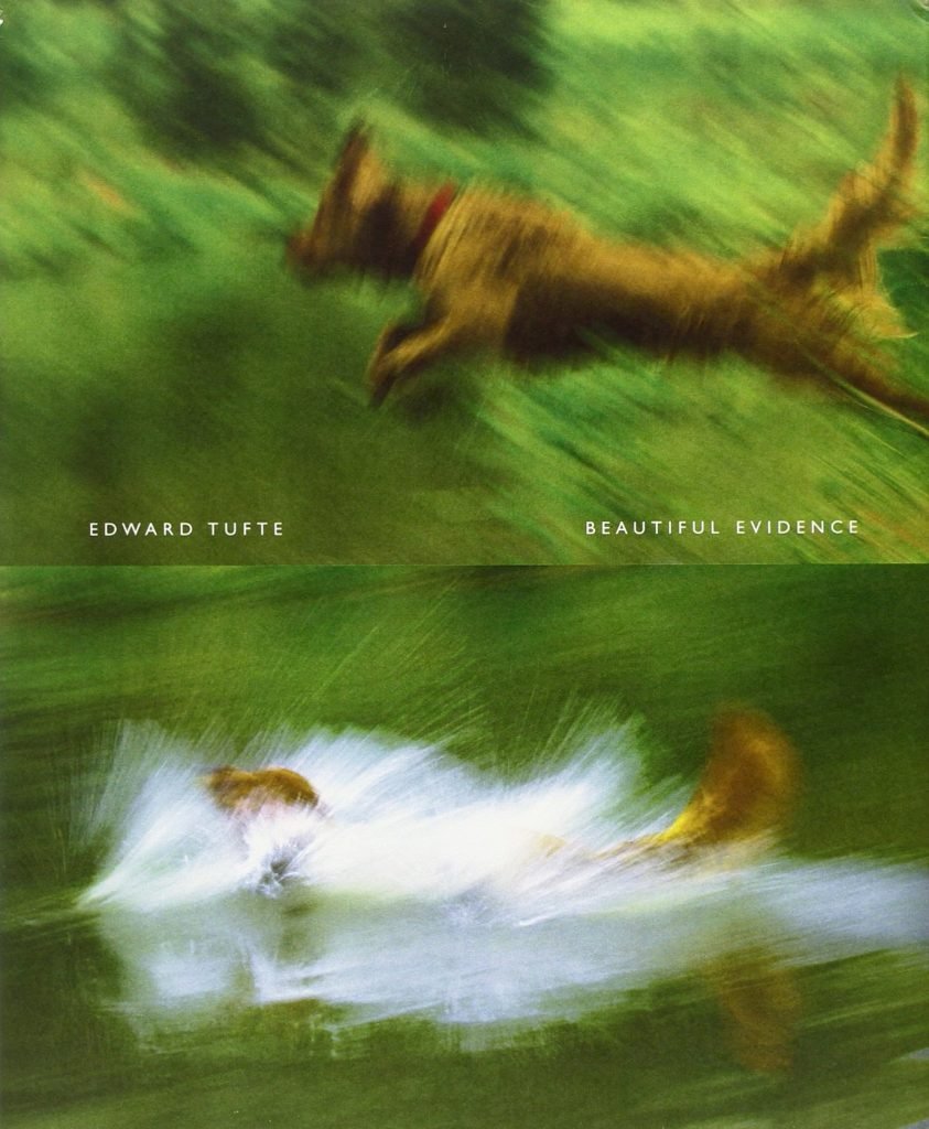
As I was getting deeper into UX, I read this. My immediate need was to develop a dashboard for call centre agents. I was exploring d3.js and this book together. Both fed on to each other. One of those books that takes on a seemingly boring subject – display of information – and turns into a fascinating topic tour.
I enjoy reading Tufte because you get it all: elegant writing, beautiful illustrations, historical perspective, and useful practical advice, all in a beautifully book.
Examples of various forms of graphic presentation are described in the chapters—images, sparklines (statistics presented as data words), arrows, mixed-format words—along with concepts of how to use them well (with examples both good and awful).
Join to get sneak peek into what's happening
I write about books, experiences, product, UX, EdTech, early stage growth, validation – mostly tech. Subscribe if these topics interest you. Once every 15 days emailer. I promise – No spam. (I am known for it otherwise) 😉


