
It’s easy to be ‘difficult’,when you are designing tech products and content as it is to be consumed by the reader to seek an outcome. The information presented here will give you a detailed structure of the readability, flow, length, formatting and relevancy for the perfect content. Storytelling and Visual elements play a key role for a broader concept of learning.
Content is easy to copy. Difficult to conceptualize and build.
Beyond the content there are many subliminal signals that you need to engineer to make it effective.
A checklist based approach to it is bound to fail. An iterative approach is assured to succeed.
This is a case of “doing it the hard way is the easy way out”.
- Words:5044
- Type: Video + Post + Slides
- Video:1
- Slides: 1
- Topic: Humans Of EdTech
- TIME: 16 Minutes
Hi, welcome to another episode of humans of EdTech. My name is Mayuresh. And I welcome you once again to this particular segment, which are called the humans of EdTech. Let’s directly jump into the topic for the day. What do we have for today is it’s easy to be difficult, right?
So what this essentially means is that when we’re designing tech products, when we’re designing content, when we’re designing experiences, the difficulty of the content is something that is very important to be calibrated, because the learner is there to consume the content, the learner is there to seek an outcome and the outcome for the learner can be a job, permanent skill, upgrade a comprehensive exam, a certification that he or she needs to clear, so it can be multi fold.
So it is very important that the learner stays in the ecosystem, the learner stays on the platform or the product and consumes the content and gets the outcome that he or she is looking forward to. And that’s why the difficulty level is one of the very critical things that you need, you absolutely must get in, right.
So this is a very introductory treatment to this particular subject where I’m essentially going to help you understand the various levers, measures of the various parameters by which we perceive the difficulty.
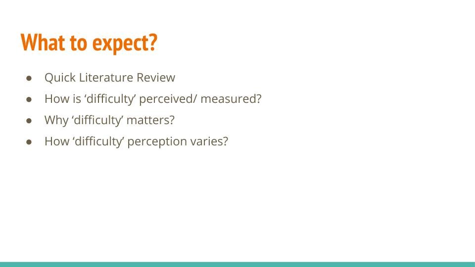
Let me just quickly jump into this. So we are going to have a very, very quick literature review, we are going to look at how the difficulty is perceived or measured. Then why does it matter? And how the perception typically varies?
This is a three posts series where I’m going to get significantly deeper into just the difficulty part and how we tackle it from a broader perspective, and how are the things we can, you know, make things simpler, and you know how it impacts some specific business outcomes. So let’s just dive deeper in this particular thing.
A Historical Review
Historically, I’ve looked up quite a few papers with respect to what is it that is available on difficulty. So, a vast amount of literature is essentially available for primary, pre family essentially students and skills typically evaluated over there/slash the difficulty is measured for reading comprehension, math, verbal ability, it is typically in those folds where the tests administered are typically the reading comprehension based and the difficulty of the subject is measured as the lexical difficulty that is, with respect to the kind of words structure of sentences, length of sentences, so on and so forth.
Google search will reveal things like Kincaid readability scores. And there are multiple such readability scores. So I think that’s something that we can explore where I am going to come from and I would like to focus on is the difficulty calibration for EdTech products for adults, and specifically on tech products, because that is where I think I have some firsthand insight.
So jumping on how to measure and perceived difficulty. Some of these are quantitative measures that you can put into place and some of them are you saw these measures you can perceive because either you have had the privilege or the position where you have observed enough number of students is an online environment where they’re consuming content or receiving education with the help of a mentor, or in a classroom environment this is where, I can vouch.
I have had the chance I’ve had the privilege, where I’ve been sitting in a class where the mentor is delivering the sessions. And I’m purely observing the mentor and purely observing the students what kind of questions they are asking, making notes, understanding. It’s a very, you know, enriching experience where you really, really understands.
And if you do a job thoroughly, you will be able to see some very strong trends with respect to students who are asking a particular type of questions with respect to experience brackets, their need for getting a job, their current income levels.
So I think all these have a very significant impact. So that is a discussion for a separate point in time, but let’s just quickly jump into how to perceive and measure difficulty.
All right, so length, you know I’ve taken different mediums over here. Mediums can be your slides videos; it can be text, then text content, latex formulas, tables, examples, external links, schematics and so on and so forth. So, essentially the length of the videos typically has all the material underlying has some sort of a clear correlation with the difficulty perception.
Ideally, all of this should be supported by a study, which is both quantitative and qualitative. And there is you know, if it is some sort of a qualitative exercise, you’re looking at some sort of focus group or index sorting, card sorting based exercise or if it is a quantitative exercise, which to certain extent, we have been doing at GreyAtom, we would be able to have a very decisive input over here.
And that’s where we are essentially, you know, this is something that we have seen, because we’ve delivered enough number of sessions to students to faculties, professors, corporate executives, and this is what typically comes out.
So, slides with low dwell time and rapid transitions when you’re kind of very quickly moving through the presentations and you’re breezing through somewhere, there is that piece you are moving, there is a great amount of transition that is happening.
And I’m talking about, you know, not something that is very, you know, visually directing or anything of that sort. But something that really moves and that is a sense of progress and it is a sense of transition over there.
So those kinds of slides have a very, I would say friendly appeal where you are able to kind of grasp a topic, I think I’m taking one feature at a time. So it is like citrus Paribas in everything else remaining the same. This is what I’m essentially talking about.
If you’re staying on a slide for a very long amount of time, if it is a pre recorded video and you’re staying on slide for like, five minutes, there is definitely something that we need to look at over here.
Like this particular slide, we want to spend at least four to five minutes, but the perception of difficulty of this particular slide so you can get it for yourself.
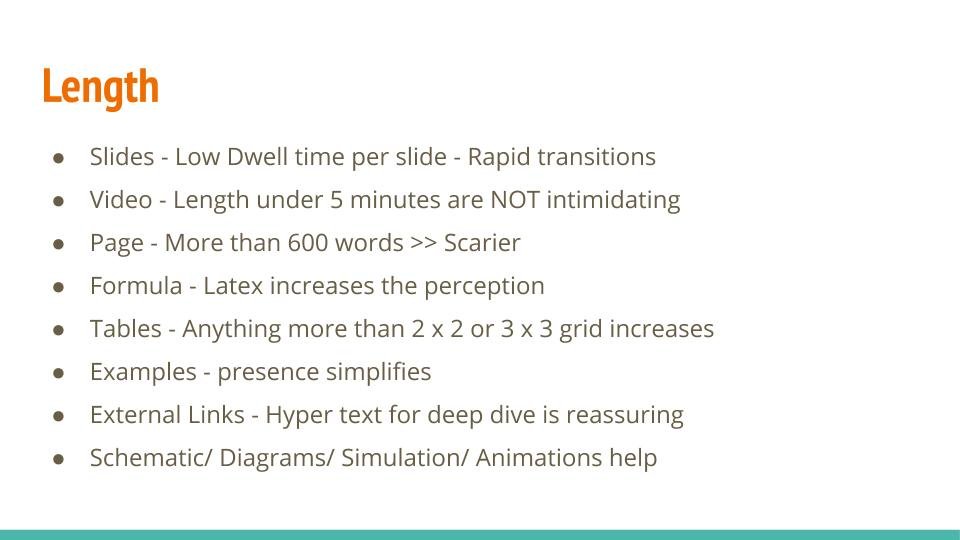
Videos, if they are too long, too dense, they can be intimidating. Videos, which are very well planned, well edited, under five minutes and very well planned with respect to flow of content, they definitely have lower difficulty perception.
If it is a dense text, very long about more than 2500 words, then you tend to feel slightly intimidated by those pieces of content. Anything that has a mathematical formula, people have some sort of fear any which ways and I’m generalizing over here, irrespective of caste ethnicity or anything of that sort.
But this definitely has some sort of intimidating effect, okay. So something that is like an alert that goes off in your head, some sort of an integral or derivative sign. So we need to look over for these kinds of triggers.
Tables, so if it is a two by two grid or a three by three grid, the mind says that there is an attempt to simplify attempt to clarify to build out a framework, but if it’s like a tabular structure with like 11 columns and 20 rows, then you’re looking at some sort of, okay I need to interpret this, because you’re not interpreting this once you see it.
There is like a cognitive load that needs to be exercised over there. So that’s essentially you know, with respect to the tables, examples, if you’re bringing out examples, visually simulations that do make life very simple. If there is just the presence of examples, the presence of case studies makes things okay.
The person is making an attempt to make this thing clear. And maybe it’s not that difficult. If it is very well connected whether internally within the same document or two outside entities, there is a very clear you know, okay there is more help that is coming your way.
So, these are the things which make the perception or difficulty slightly lower or acceptable. Schematics, diagrams, simulations, animations definitely make life much simpler. So, that definitely does help.
What I am talking about here is what we typically say as subliminal which is not overt, which is not explicit, no one is giving you a difficulty meter, there is nothing read over here.
This is a very subliminal so these are all subliminal cues, which you, as an educator, as a product manager can plant, if you are SME, who’s designing your subject matter, these are these are the things that you can plant in your subject matter the things that you can take as some of the rules.
So these are decisions which you can consciously own and take some of these experiences forward.
The Ken Factor
I am one of the customers just like I’m sure many of them on the newsletter or the website or the Ken, and it has been a couple of years I’ve been consuming the paid subscription of this particular product. I’m one of the supporters.
I like the kind of work that they’re doing, and the quality of articles that they’re essentially building over a period of time in the house of Ken mature out. The quality is up and down at times, but I think it is some good journalism, good paid journalism at work.
So I would like to take something from them and I would just like to call this the Ken factor. Yeah, I think there is a subject. The number one thing is that each of their articles has a very clear topic which is very, very catchy, there is a subtitle.
That’s the thing written over here. There is a typo in the subtitle. There is a four point summary that typically shows below a Ken article
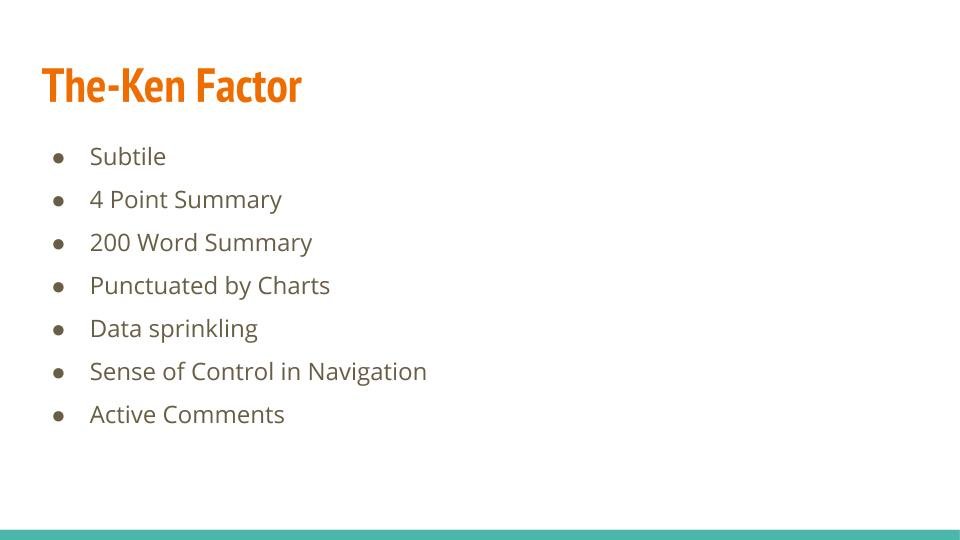
Then there is a 200 word summary. Because the Ken articles are designed to be anywhere in excess of 1500 to 3000 words. You probably want to give them a short summary of 100 to 150 words. It has very well developed charts over a period of time they have built visual appeal which is very proprietary of them.
The important part over here is it is punctuated by charts by diagrams by schematics by info graphics type material, well, then, you know, driving home the key points. It is also punctuated by some of the key quotes that the actors interviewed for that particular post are also doing.
They’re sprinkling data across the post. And whenever I think the sense of control and navigation is not probably what they really do, but I think you will keep on scrolling, the length of the article can be gauged by the size of the scroll bar that you’re able to see on the right hand side. Or probably if it’s a mobile device, you’re able to just when you’re scrolling, you’re coming through it you’ll be able to see okay, this is the article that gives you a sense of navigation.
But again, I think this is something that can very easily be influenced by the user experience, it’s very easily fixable thing. And finally, I think they have active comments. The articles keep the comments active, a certain point in time beyond which I believe they’re disabled. But all of these things make the subject matter, which is very layered, which probably has, you know, counter and for views, which is very argumentative at sorts, which can be critical of businesses and subject matter, which may at some point in time, involve expounding on concepts which are slightly alien.
And more importantly, there is some amount of storytelling that is involved. So I think to bring some of these elements or all of these elements together and make a compelling read.
And that being the determinant of revenue, I think it’s a very hard task and I think they have set a benchmark over here, I want an appreciation of what these guys are doing at the Ken.
I believe when the educators put together their curriculum course materials, they can definitely borrow from this particular thing. So when you’re planning out your video and you’re planning out your long form content when you’re planning out anything, I think these are some very, very strong indicators.
So whether you’re, you know, developing content to introduce a topic to deep dive to reinforce the concept as a revision material. I think this is what you need to borrow in different bits and pieces. So I think that’s why I just wanted to quickly, you know, highlight this. I just call it the Ken factor .
Storytelling: A Crucial Thing
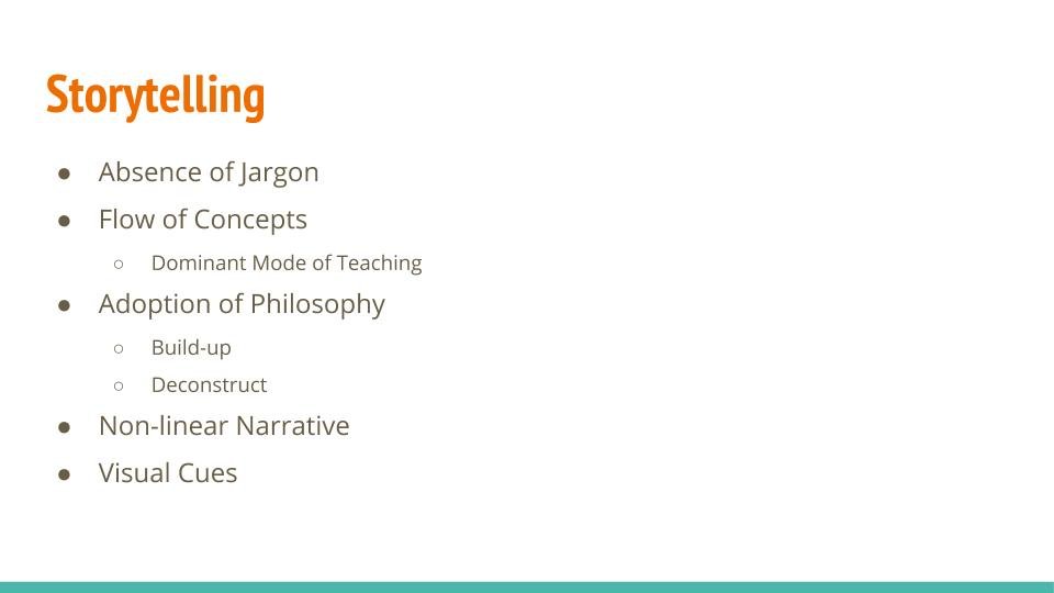
Storytelling, it is very important, guys. So jargon don’t turn on people by enlarge, if your subject matter is to be delivered in the online remote environment, isolated, and you really want people to learn and pick up what you’re doing, not be impressed by you for what you’re dishing out.
Using the jargon in the right proportion is very, very critical. Front loading them, maybe intimidating, introducing them, you know, explaining them what this whole thing is, and then saying, you know what this is the fourth law of thermodynamics.
Okay, we are going to discuss entropy. No, I think there is a much better description. There’s a much better way to communicate the same concept. If you can keep the jargon and can just introduce it at the right point. I think that really, really does help.
Second is I think what I call typical is your flow of concepts or dominant mode of teaching. There is a dominant mode of learning, every learner, every individual has it.
It is a function of their grooming, maybe link to you know, behavioural functions, maybe dependent on their past education, whether they’ve taken a lot of stem education or they’re more from these, you know, humanities and arts and commerce’s everyone may have a different will define dominant mode of learning.
Educators on the flip side, have a dominant mode of teaching. So whether you’re looking at a particular mentor, instructor professor, you will be able to observe people and say, you know what, this person, the way he brings out the concepts is examples, examples, examples, awesome nice.
But this particular Professor on the flip side starts with the six standard mathematics and builds up the concepts and he’s able to kind of show you know what this is just like what you did back in the seven standard six, standard and it’s easy.
So then it’s like helping get rid of the fear, selling the concept to them, creating that buying, and then introducing the concept or the core subject matter.
And I think we can, you know, speak about dominant modes of teaching or modes of teaching or ways of teaching, and that’s a separate discussion. But bringing in a human element or storytelling elements, well, there is a very clear, well defined narrative, not necessarily a linear narrative can be a nonlinear narrative, and we’ll speak about this in time to come but a very well defined narrative.
The sequence of the topics and the subjects is very well you know, introduced, defined and that’s the key thing. I think a small example over here a lot of people essentially will introduce something as basic as regression or starting off with data sciences and machine learning.
They will place a significant premium on you needs to know maths, you need to know stats, that’s the prerequisite to start some of these topics. The fact of the matter is that yes, you need to know stats you need to know maths but those are not prerequisites.
Those are not prerequisites to start; it is not that the person does not know mathematics it does not. People don’t exist in that kind of silo and vacuum. People have some concepts, they understand what is happening on the board on the screen in the video.
They do not have names or the concepts are not very much crystallized in their mind, so making them as prerequisites is essentially installing mental blocks in people’s mind. And that involves learning.
So, the flow of concepts can be we start in a very programmatic way or we start developing a visual intuition, or we do some sort of geometric simulation, we get the concept for the regression in place.
And then we say, you know what, we did this in this standard. And this is what you need to pick up. And this is what you need to revise, just revise this particular part.
So introduction of concepts in the right sequence to flow if you get that particular part right, the absorbability of what you’re essentially teaching goes up significantly. So that’s essentially what we want to, you know, bring in the flow of concepts and storytelling in general.
Finally, I think adoption of philosophy, I think it’s a very deep point, I possibly should have divided the slide into multiple slides. But adoption of philosophy, I’ll just break it down into two parts one is to build up and second is to deconstruct, let me start with the deconstruct, we show someone an automobile and then we just take it apart.
We separate the chassis, we separate the wheel, engine, power train, steering, suspension, safety security systems and you start deconstructing it. And you can deconstruct it to a very different level of granularity. And then you can see you know what, these are the small stuff that you understand possibly.
And this is what you learn in your first to second year of engineering. Because you understand the parts, you understand the larger part.
So I call it typically the three principles where you first show them the product, you deconstruct it, chop it, you break it, you simplify it, you come to the prototype, you deconstruct it, we chop it, you break it, and you unlock the principle. You tell them what is the underlying principle over there?
So that’s essentially is the deconstruct, you know, school of thought, where essentially, if you’re able to typically when you’re teaching a lot of adults, they’re able to see things in and around them and they’re able to perceive and they’re able to understand, you know, this is how it works at a higher level.
I don’t know what goes on inside, but this is how it works. If someone helps me deconstruct this, I suddenly have more interest and more precision. And if you’re able to bring it down to first principles, we have something special.
The builder on the other side, that methodology subscribes to, you know what? Let’s start with a whiteboard with a green screen. And let’s start building up concepts as we kind of progressively move.
If you’re introducing a very new subject, some of these methods can work, where what we’re leveraging over here in the buildup technique, the buildup metrology is that familiarity, if you very well understand to the code is homogeneous, and we understand what is the background of each of those students, and we are able to very clearly map out that this is what the person or this is what the court typically knows has knowledge of, and we are able to map it out with the historical data points or historical knowledge and you leverage the familiarity and you keep on leveraging that, so that how you build it up.
Awesome, Nonlinear narrative, I think this is best exploited by some of the best movie makers all across the globe, where we have the flashback where we start with a particular scene, and then suddenly, you know, there’s something very somebody is on the deathbed, or someone just had a very, either tragic on an extremely euphoric moment.
And then the whole story goes into a flashback. So it’s basically you start telling the story and then you go back, and then you again, start telling a story. Maybe you again go back to a flashback or you come back again, and the story kind of hops back on the past, future, present, past, future present, present, past present past. So, there is a very well defined attempt and exercise at the narration that is non linear.
Movies have exploited this very well, explaining concepts switching between granularities, switching between levels of abstraction is very, very critical and can be extremely effective.
When you’re discussing something at the first principle level, you’re certainly going to the prototype level and then you’re going to the product level, and then connecting the three and that kind of stitches the whole experience for you and you kind of repeat this exercise again and again and again. So it makes the appreciation of different concepts really, really very, very strong.
Finally, the visual cues, now the thing with visual cues, is, you know, there is a dedicated section last slide for it. But essentially, I think If the material that is being presented to you in whatever format, it looks nice, it looks more appealing, there is a higher chance it is also going to look a little bit more easy.
If it looks complicated, if it looks difficult, if it looks not appealing, and I think I’m just trying to subtract all the cultural context and you know all those variables out. But if it looks okay, this is tough, this is hard, this is complicated, it is going to translate into the difficulty factor from zero.
So just to summarise over here, I think if you have a very strong storytelling element with respect to flow, with respect to philosophy, with respect to the narrative, with respect to the absence of jargons, and with respect to whatever is there on the screen, if it looks nice.
We have a winning combination, where the difficulty can be moderated. If you’re designing a product, if you’re designing a content, these are some of the things that you will need to pay attention to get your difficulty.
We already spoke about the visual element. I’m not sure if I have anything quantitative, quantitative with respect to each of these things, but I think this is the basics if you’re doing user experience for some amount of time in life, you will typically get it you know, with respect to font, hierarchies, layouts, typography, getting the colours, right pleasing colour combinations, colours have their connotations, the cultural connotations, contrast, usability might more, the more maxing out the screens for distraction free.
I think this is a very different sequence, a very different depth possibly it’s not the, you know, we won’t be able to do justice in a particular screen or section. But the visual cues and the visual elements play a very significant role in with respect to the difficulty perception.
Great. So we’ve had a look at how to perceive how to measure the difficulty. Now, let’s just quickly Have a look at why the difficulty really matters. You know, what does it really impact? Great.
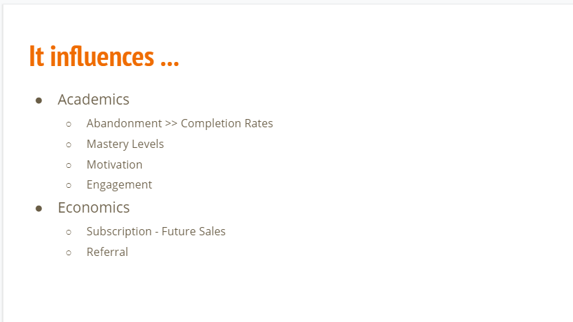
So it influences the academic outcomes. It influences your completion rates, your abandonment rates, it influences whether people are really interested or they lose interest and they go away.
It really impacts whether people get invested in your product, they attain the learning outcomes that they are looking out for, whether they’re staying motivated, what kind of proficiency levels that they’re developing.
Most importantly, are they interacting with your platform? Are they interacting with your content? Are they interacting with your channel that you’re trying to establish with the learner is their engagement.
So this has to be appropriately planted. So, as you know if the famous book flow goes, it’s basically the right difficulty quadrant that you want to establish with respect to difficulty and your level. So that’s very, very important over here.
It has a clear impact. You can design a product where you make people feel really happy that they are progressing to the mountain and you’re learning and they’re doing stuff and they’re unlocking certificates and levels and grades one after the other. But the outcome is not coming over here.
So it’s not really an effective piece of product. The material does not bring about any kind of a transition. So that’s going to impact your revenue, that’s going to impact your, you know, word of mouth and referrals that typically comes along with it. So there is a very clear economic impact over there.
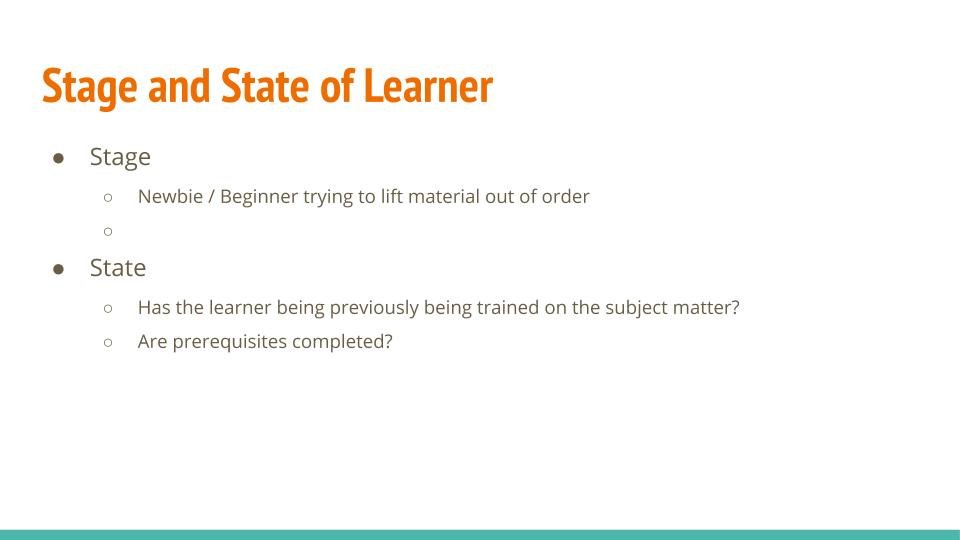
How does the difficulty perception vary? So this is a section that I’m going to really rush through. But that is why I started this particular conversation, I said that I think there is a part two and part three of this particular topic that’s coming up.
And possibly, I think these other sections that we really, really need to dig deeper into the right state and state of learners. So very simply put, I think, if you’re just joining the gym on the first day and you’re trying to lift something that is very heavy, you won’t be able to do it, and probably might be able to fight the problem, you might end up injuring yourself.
Now the thing is that if you’re able to, if you’re if you’re positioning content to the learner, which is inappropriate to his or her stage, you will have a problem. Similarly, if you do not have the understanding of the learner and their prior journey, academic journey, you will have issues.
The indicators that this is a beginner friendly or intermediate or an expert level curriculum subject to a certain part, but I think it is a far more nuanced topic than just putting those things in place.
And finally, I think if the prerequisites are not appropriately flagged, the prerequisites are not done, then whatever is your difficulty rating, low mid high, it’s all going to go out of sync.
So that’s where the perception can vary. It’s not a universal indicator, it’s something that can and does the time to consume. If you give a particular piece of content a given time rating to it. This is something that you can complete in 15 minutes. This is something that you can complete in 60 minutes.
It is not that the higher time typically indicates that this is more difficult. There multiple things that play over here. So if you read the timing incorrectly, or it is not based on any first hand understanding of what the subject matter is all about, then you’re going to demotivate the learner in a very significant way where you’re saying that there’s something that needs to be completed in one hour.
But the learner is doing it for four hours in multiple days and is not making any progress. So clearly there is something that is missing. And you’re trying to build a programme or a curriculum on the flip side where you’re putting together this is a programme that takes 78 hours and what you’ve put together is probably 60 assignments. And you know what? This looks dense.
So, the time to consume rating has a very strong impact perception correlation on the difficulty rating over here. So, it needs to be appropriately given a slash measure.
Very, nuanced point over here. Same question, the different difficulty if you ask the question in a physical paper in a competitive exam, if you ask the same question as a multiple choice question on the web, in a proctored assessment and in an un proctored assessment, open versus closed book and interview seating where someone is sitting in front of you observing you versus an exam seating, where there is a community proctoring that is happening. The same question can have multiple perceptions.
So the media and the context in which the question the top the subject matter is administered has a very different kind of impact not only from assessments perspective, but also from teaching learning perspective, if you are bringing if you’re explaining certain concepts, and if you’re doing that, you know, online channel media then it can have a very significant impact with respect to how it is being perceived. So, yeah, I think that’s pretty much it on the media and the context part.
Awesome. So thank you so much, guys. If you want to see more of these updates, you can follow me on LinkedIn and stay tuned for more and more updates, also, it was a long video. Thank you so much for watching. I need to rush. I’m sure you need to rush and I’ll get back to you with another episode of humans of EdTech. Thanks bye
Photo by Andrea Piacquadio from Pexels

Join to get sneak peek into what's happening
I write about books, experiences, product, UX, EdTech, early stage growth, validation – mostly tech. Subscribe if these topics interest you. Once every 15 days emailer. I promise – No spam. (I am known for it otherwise) 😉