People are so busy in their day-to-day life that they don’t get enough time to spend on details. Uncluttered and straightforward navigating platforms are their first preference
The professionals are busy in their daily routine, so they don’t feel like spending more time searching for a particular course for them. Thus, highlighting some suitable techniques you can use while designing the course for such busy bees.
- Words:951
- Type: Post
- Video:0
- Slides: 0
- Topic: Humans Of EdTech
- TIME: 6 Minutes
It is natural that after spending a tiring day, you spend your night searching for a suitable course and scratching your head if you fail to do so. So the e-learning platform must design its course so that a learner finds it easy to navigate. The learner can use it any place and at any time with no difficulty. Below are some suggestions that you can use while designing the course for busy bees!
1. Relevancy and Redundancy or the R and R test
It is just that the content present on the online course should be relevant enough that it does not waste the learner’s time and energy. With Redundancy, I say that the content should not contain unnecessary or useless content. So the developer’s ultimate aim should be to pass this Read R test. The things included in the course must be skilful and valuable enough to provide real-time experience to the learners. The content should be written according to the learner’s perspective to get the desired result after reading it. New research should also be included in the content as no reader wants to read that old information already on several platforms. Busy professionals or learners want to read material that is up to date. They don’t have time to read the basics available everywhere.
2. Make the reading effortless.
Usually, complicated readings tend to make the learner lose their concentration. And on top of that, if a learner is busy and has less time to spend on reading, they will not even have a look at it. As a e-learning course developer, you need to be straightforward with your content. You can do this by providing a short and crisp summary of the topic so that the learner may get an idea of the entire thing. Try to give the vital information in the beginning only so that the learner may not have to scroll down entirely to search for the important news. Then provide the relevant information in detail so that the person who is not busy may read, but if they don’t have time, then can only read the starting point. You can add visual effects like checklists, graphics, images, etc., to make it appealing for a better view.
3. Make use of eye-catching elements.
A busy learner is always in a hurry; you have to design your content to attract the learner’s gaze. The eye-catching elements can be highlighting the important words or points, making them bold, or underlining them to be easily visible. The critical information listed on the top must contain keywords that are highlighted. You have to guide the learner on what is essential to be read first. Guide them that the key information is in the frame. Provide enough space between the points. Because often it is found that the learner gets confused due to many things being written one after the other. All the information should complement each other so that the relevancy of the content is maintained.
4. Simple and easy navigation
Having the right content is unnecessary, as it is of no use if the learner is not able to find it. Yes, it is possible because busy learners look for familiar buttons or icons to search or find things. But if they don’t understand which option is present, then no one can stop them from leaving your eLearning platform. If your e-learning platform contains a new form of layouts or buttons, then the best thing, in this case, is guiding the learner. Your priority should be to keep the navigation as straightforward as possible so that it may not waste the valuable time of the busy learner. Mark all the necessary links and buttons clearly to guide the learner to land at the desired page or content.
5. Keep the content short and organized
Short and well-organized content is all a learner wants. Make it into bite-sized chunks so that the content is crisp and concise. Keep the points that are connected in one group. For your ease, follow the proximity or rules to break the content. Bite-sized chunks are well known for engaging people more. This will also increase the efficiency of your content. The learner can easily absorb the information provided.
6. Personalized experienced is a must
The things that you include in your e-learning course, from icons and buttons to the type of content, all these things should be personalized. If the learner finds personalized stuff different from other platforms, they will never think of leaving your course. Personalized and meaningful content is every learner’s need. Try to gather the information about what type and duration busy learners want to experience a course. All this information can be collected through surveys or feedback.
Conclusion
The suggestions mentioned above, if rightly followed, will let you end up creating a practical eLearning course for all the busy bees who do not have enough time to look for various learning courses. A personalized course with the right content will let you maximise engagement to your learning platform.
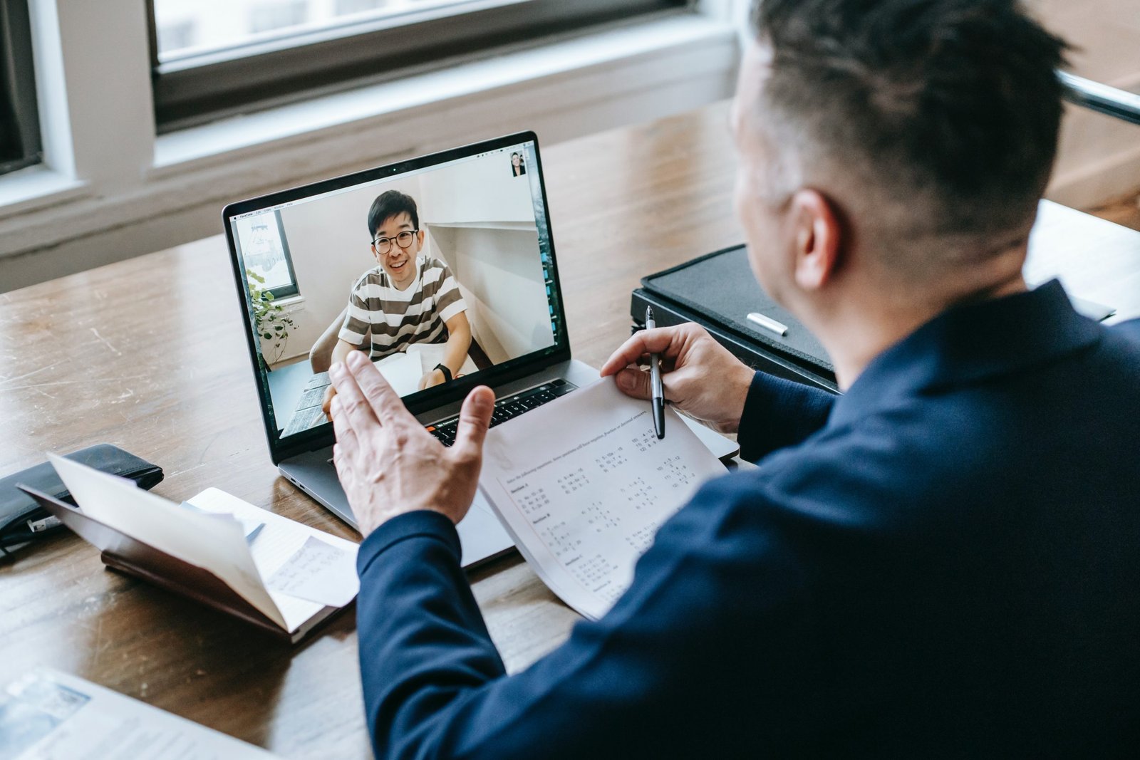
Photo by Anna Shvets from Pexels.

Join to get sneak peek into what's happening
I write about books, experiences, product, UX, EdTech, early stage growth, validation – mostly tech. Subscribe if these topics interest you. Once every 15 days emailer. I promise – No spam. (I am known for it otherwise) 😉